- Decide what magazine you would like to design a cover for. Here are logos for different magazines you can use.
- With a partner, take photos of yourself for your magazine cover.
- Select the photo you will use and color correct it.
- Image/ Adjustments/ Auto Levels
- Image/ Adjustments/ Brightness Contrast
- Image/ Adjustments/ Hue & Saturation
- Add in your magazine title/logo.
- Add in headlines for at least 3 featured articles.
- Make sure your cover looks balanced!
- Add a barcode and price for the magazine.
- Turn in in the Graphics Folder/ CongerGraphics/ Graphic Communication/ Magazine
Tuesday, December 18, 2007
Magazine Cover
Thursday, December 13, 2007
Energy Drink Assignment
1. Start with a new Photoshop Document
Image size is 7.875” x 6” (horizontal), Resolution is 200
2. You must think creatively to come up with:
a. Original Drink Name
b. Original Company Name
c. Who is the target audience? (example: business men in their 30’s)_
3. Your Logo:
i. The font reflects the kind of drink
ii. The colors reflect the kind of drink
4. Product description (flavor, caffeine, diet, etc.)
5. Include other product description (how many oz., ingredignts, warning label…cans, etc.)
6. The completed design shows unity and is interesting to look at.
7. It is saved as a JPEG and turned in:
Graphics/ Conger Graphics/ Graphic Communication/ Energy Drink
Tuesday, December 11, 2007
Graphic Communication
Today you will analyze an artwork with a partner. Then you will finish your quote and turn in in the Graphics Folder.
Extra Credit: Create one of the text effects on this page. The tutorial will take you though the process, step by step. Make sure the word you choose to do the effect on matches the style of the effect! Turn in a flattened copy of your result in the GraphicCommunicaiton/Extra Credit folder. No white backgrounds, please!
Monday, December 10, 2007
Friday, December 7, 2007
Graphic Communication
Graphics Folder, CongerGraphics, Graphic Communication, Famous.
Web Graphics
You will watch some watch a episode of "It's Geek to Me" about making videos with camcorders. This is the link to the video
You may have to click next a couple times to get to Camcorders 1, 2, 3 & 4. Do the worksheet along with the video.
- Find a quote online. Include the person’s name who said it.
- Copy it into a Photoshop Document sized 10 inchex wide, 8 inches tall and resolution 150.
- Use Text Warp and Layer Styles to give your quote some cool effects.
- Add in a collage in the background. Use multiple pictures. Think about textures and colors that will go well with your message.
- Save your work as LastnameFirstnameQuote.
Graphics Folder, CongerGraphics, Graphic Communication, Famous.
Web Graphics
You will watch some watch a episode of "It's Geek to Me" about making videos with camcorders. This is the link to the video
You may have to click next a couple times to get to Camcorders 1, 2, 3 & 4. Do the worksheet along with the video.
Monday, December 3, 2007
Collage Theme: Famous People
Create a photoshop collage on the theme "Famous People"
- Use a high resolution background image
- "Large", 1000 pixels + in Google Images
- Open up in Photoshop and add at least 5 photos to it
- Use appropriate selection tools
- Make neat and clean selections
- Feather the edge 1-3 pixels
- Hold SHIFT to Add to a Selection
- Hold OPTION to Subtract
Elements Examples

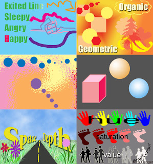
Your assignment is to put together all your Elements of Art Examples created in Photoshop.
- Line
- Shape
- Color
- Form
- Space
- Value
1. Make a new document
size: 14 inches , 15 inches, resolution 72
2. Open each example
Layer/ Flatten Image
Use move tool to pull into your new document
3. Save As "LastFirstElements"
4. File/ Print with Preview
Check the box next to "Scale to fit Media"
Printer: Room 129 Color
Name: colorprinter
Password: color
Friday, November 30, 2007
Wednesday, November 28, 2007
Graphic Communication
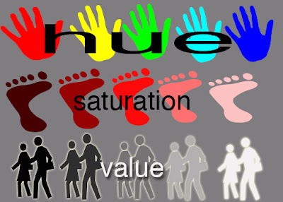
Notes on Value
Example of Hue, Saturation, Value
1. 5 different hues (colors) across the top
2. Most saturated shape in the middle.
Add white to the ones to the right (less saturated)
Add black to the ones to the left (less saturated)
3. Darkest value at left, Lighter values to the right.

Web Graphics
Plan for PhotoSequence Project
· Work with a group of 2-4, you can recruit actors outside your group
· Create a Plan before you start
· Start shooting
· Start working in iMovie on Thursday
Notes on Value
Example of Hue, Saturation, Value
1. 5 different hues (colors) across the top
2. Most saturated shape in the middle.
Add white to the ones to the right (less saturated)
Add black to the ones to the left (less saturated)
3. Darkest value at left, Lighter values to the right.

Web Graphics
Plan for PhotoSequence Project
· Work with a group of 2-4, you can recruit actors outside your group
· Create a Plan before you start
· Start shooting
· Start working in iMovie on Thursday
Monday, November 26, 2007
Graphic Communication
Review Element of Space
Art Institute International Presentation
Work on Texture Example
Web Graphics
1. Finish Landscape Collage. Save your collage as a JPEG
2. Turn in in the Graphics Folder
3. Create a new webpage on your site (click on the plus sign in the lower left corner). This will have hold graphics projects you will do this quarter. Name it "Projects".
Put your collage in this new graphics page
4. Create a new Blog post- how were your days off ?
What are your personal goals for this week?
What are your professional/school goals for this week?
Start to work on photosequence planning sheet and view examples.
Tuesday, November 20, 2007
Graphic Communication
Finish Space Example Demo
Texture Example- Collage of Textures found online
Web Graphics
Photoshop Collage on the Theme "Landscape"
Use at least 5 photos cut out and arranged on one background
Try to make it look realistic!
Save as LastnameFirstnameLandscape
Finish Space Example Demo
Texture Example- Collage of Textures found online
Web Graphics
Photoshop Collage on the Theme "Landscape"
Use at least 5 photos cut out and arranged on one background
Try to make it look realistic!
Save as LastnameFirstnameLandscape
Monday, November 19, 2007
Graphic Communication
Notes on Space and Texture
PDF of Elements Notes
How to use Lasso and Move tools to make a basic collage
See video demonstration
Web Graphics
Video Demonstration: How to upload your iWeb site using Fetch FTP software
Review Photoshop
Photoshop Collage on the Theme "Landscape"
Use at least 5 photos cut out and arranged on one background
Try to make it look realistic!
Save as LastnameFirstnameLandscape
Thursday, November 15, 2007
Graphic Communication
Review:
Watch Artist's Tool Kit Cartoons
Geometric & Organic Shapes & Forms
Warm & Cool colors
Learn:
Photoshop Selection Tools
Complete:
Examples for Form and Color (see instructions below)
Maybe Space?
Web Graphics
Finish "HTML, the Sequel" blog post and publish with Fetch.
Review:
Watch Artist's Tool Kit Cartoons
Geometric & Organic Shapes & Forms
Warm & Cool colors
Learn:
Photoshop Selection Tools
Complete:
Examples for Form and Color (see instructions below)
Maybe Space?
Web Graphics
Finish "HTML, the Sequel" blog post and publish with Fetch.
Wednesday, November 14, 2007
Monday, November 12, 2007
Graphic Communication Color Example

1. Using your paint bucket and paint brush tools, make a background of organic shapes and warm colors (red, orange, yellow and pink)
2. Using your shape tool, make a repeating pattern of geometric shapes in cool colors (green, blue and purple).
3. Lastly, experiment with the Filter tools. Go to the filter menu at the top of the screen and scroll down to “filter gallery”. Click around in this box to see some special effects. DO NOT change it so much that the warm/cool colors are changed!
4. Save your work as LastFirstColor. Save in your Graphic Communication folder.
Wednesday, October 31, 2007
Subscribe to:
Comments (Atom)


